Project Brief
You have been commissioned to conceive and develop the graphic styling for the Sheffield College magazine, and present your designs to representatives of the college ‘Enterprise Team’.
My Response
Initially I’m quite excited about this project and also a little frightened about getting it right. I have taken from the brief the fact that this magazine needs to be student focused and incorporate Sheffield culture, entertainment and news, the magazine is not to publicise the college or its courses, but to promote the city. The magazine must appeal to a diverse and contemporary audience and needs to be creative and exciting looking. I am a big fan of the regional magazines, particularly ‘Exposed’, which is something I regularly pick up, I enjoy the majority of the articles and the mag is an excellent way to promote up and coming concerts and events in Sheffield. I feel the mag works well to appeal to a diverse audience, it has a variety of articles within in it to capture the attention of a diverse range of people, I often skip through the mag reading the articles which capture my attention or interest me. The mag is easily accessible and strategically placed throughout the city, this allows the mag to increase exposure and promote local businesses to a variety of age groups.
Research

I already had a few of the magazines at home, such as ‘Exposed’ and ‘Now Then’, I decided to go round the bars in Sheffield (purely for research purposes!) and pick up some of the mags, which are often found in the more ‘trendy’ bars on Division St, there are also mags such as ‘Beer Matters’, which promote local breweries, bars and real ale festivals. I also gathered some of the regional magazines which are delivered a specified postcode area, I have ‘Active8’, which is where I live and the Eckington and Killamarsh ‘Doorsteppa’ from my mum’s. The mags are very different in the way they target the area, due to the typical residents that tend to live in that community. Active8 appeals to a much younger audience, whereas the mags for the village community appeals to an older audience and tends to focus on local political issues. In addition to this I also visited the Sheffield Hallam University and picked up one of their magazines ‘Review’ which offers articles of events from around Sheffield, whilst also promoting the university. My brother is in his last year in secondary school, he gave me a copy of his school’s magazine ‘Derbyshire Youthing’, which is aimed at a younger audience. It focuses its articles on opportunities available for young people and promotes health and wellbeing. It offers articles on some of the issues which affect young people, such as bullying and online exploitation to create awareness of the risks, which is relevant to the target audience.
This slideshow requires JavaScript.
The Sheffield College has a varied age group, so I need to consider my content to appeal to a diverse age group, although primarily the content should appeal to a younger audience (16-25) as this is the average age of students at the college. However, being a mature student myself , I also felt that there should be something within my magazine to help promote learning in later life, this is something I will consider for one of my articles.
Design Structure
I decided to pick out some of the more relevant magazines I had picked up and go through them one-by-one, evalute them individually as to how they are effective in relation to the target audience, also analysing the design structure, typographic styling/grid structure/production quality/stock etc.
Exposed
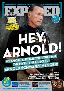
First impressions of the cover design of this magazine is that it is very hard hitting, eye-catching and edgy. The main feature is displayed very clearly and the use of a well known celebrity such as Arnold Schwarzenegger, captures people’s attention, making them want to know more. As it is established and well known magazine, they could get away with having Arnie’s head covering some of the title, the colour of the title typography fits in with the colour scheme of the feature photograph. ‘HEY ARNOLD’ is set at a slight angle in large font point to ensure the main feature title stands out to grab potential reader’s attention, then there are more features listed in a smaller font for the reader to see once picked up, these are shown with the use of typography and images. Most of the titles on the cover design are in uppercase lettering. The magazine works well to appeal to it’s target audience, which is young people and music lovers, the style of the cover is edgy and exciting. The magazine stock is a semi gloss paper, at an average weight but good quality. It would need to be printed to a good standard as this is the type of mag picked up in a bar, held in the hand for a period of time or left bustling in a handbag before it is read, therefore it needs be quite durable. Below is my analysis of the cover page, highlighting key points which I believe make this mag work effectively.

The Content of Exposed
I have chosen a spread which covers two pages to analyse, I have also chosen this one as I like the layout used.
The half circle in yellow centered at the top of the first page is consistent throughout the magazine, used to indicate the section. There is also a bold line underneath this set at 20mm from the top of the page. There is quite a bit of white space before the feature title, which starts at 55mm, which I think works well. The Feature Title says ‘Little by Little’ with the last Little in uppercase bold and a much larger font size than the first, the spread is about ‘Little Kehlam’ a property development underway in Sheffield, so this is a clever way to introduce this. (I also have the Oasis song stuck in my head after reading this! Not sure if this is intentional and ties in with the music theme of the publication!) The title is at an indent of 30mm and is aligned perfectly with the text beneath it, which I think gives a uniform, neat look. The explanatory text beneath the title is still in bold in a similar style type to the title and slightly smaller, with a faint line beneath. The text is set on three columns with a 30mm margin on either side and a 25mm gap from the bottom of the page. There are sub-headings within the text which are aligned left in bold in the same font as the rest of the text, which is around a 10pt type with a 13pt leading. The article is eye-catching and legible, giving enough away in the title to let the reader decide whether this is something that would interest them. On the second page the images are arranged in a tiled mosaic with white line spaces between. There is a quote at the side with the quotation marks significantly larger than the rest of the text slightly overlapping the images to entice the reader to read this after looking at the images, the type is set in a dark grey at around 24pt in a bold rounded typeface. The page has faint stroke borders around it with the page number and website address centered at the bottom of the page.
Evaluation
Obviously, I would say that this magazine works well to capture the readers attention as this is a magazine I regularly pick up and read myself. After looking more in detail at the design style, I can see why it is so effective, the designs are funky, catchy and colourful, the content of the magazine is relevant to the theme of the magazine and the content style is very varied, whilst still keeping some consistency throughout. Exposed is very well-produced, enticing magazine, which I believe promotes Sheffield and its culture extremely well.
Now Then

Now Then magazine is a much more art focused publication, the statement in the first page of the magazine states ‘Now Then is a free, independent magazine published in Sheffield and Manchester, It is all about supporting independence in art, trade and citizen journalism’. They encourage local people to contribute to the content of the mag. The paper stock used for this magazine is matte rather than glossy and is much better quality, more like a luxury mag, this maybe to show the artwork in the best possible quality. The cover design for this mag is mainly focused on the image with simply the name and details printed in the bottom right. The image is very powerful and clearly demonstrates the type of magazine it is, attracting the right audience who would find the content interesting.
The content has quite a simple, yet effective layout, focusing more on the artwork and images than the text. You can see that the designers of this magazine use a more contemporary, art-focused style in their articles, with the use of bold simple shapes to incorporate the typography and the images set at aesthetically pleasing angles. The magazine is consistent throughout, all articles having the coverline in white, large, uppercase font within a rectangular shape in subtle colour. The text is set at a 15mm indent and 2 columns are used to present the text, which is set at around 12pt. The first letter of the first sentence is set at a much larger font size at around 48pt, and in some articles the first explanatory paragraph is in bold, I really like this style and will consider using some of the design styles in my mag.
Evaluation
Again, I really like the design layout of this magazine and I think it works effectively to capture its target audience and promote local artists. The style is consistent and in-keeping with the theme. The articles are eye-catching, a lot of effort is made to present the artwork within it at its best and it makes for a very interesting read and visual experience.
Toast
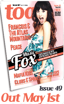
Toast promotes itself as ‘Sheffield’s Biggest Little Magazine’, this is because it is printed in A5, half the size of the more common A4 magazines. However, the size does not take anything away from the effectiveness and content of this magazine. The cover design immediately grabs your attention, its colourful, vibrant and youthful looking. The main coverline is presented in a way that makes it stand out from the rest of the cover. The cover indicates to me that this is a much more fashionable, trendy mag, appealing more to young people and students.
The articles promote bands and local concerts and events in Sheffield and are generally quite indie. Unlike ‘Now Then’ the content does not really have a set theme or consistency, each article has its own eye-catching, vibrant style, although the layout does appear to be consistent throughout generally working to 2 or 3 columns with the text set at around a 10pt.
I decided to analyse an interview spread in this magazine, as this is something that is required in our brief. This is an interview with a local Sheffield band.

Evaluation
The design style of this magazine works effectively to capture a youthful audience. I like the vibrancy and colours in the articles.
Sheffield Hallam University – Review

I decided to look at a student focused magazine for the Sheffield Hallam University, to get an idea of what they were using to appeal to students. This magazine is more focused on what has been happening within the university rather than Sheffield as a whole. The article is much bigger than the others h34cm x w23cm, the paper stock is a heavy matte quality. The cover page has an illustration of an explosion, portraying the beginning of something. The cover is not as busy as the others, this is because it is more of an academic publication.
The content is very much about the university, so is not really relevant to the type of magazine I will be doing, so I decided not to look into this mag any further.
Ready for Stage 2…
I feel I have learnt a lot from my research about what works and have got some ideas about how I would like my magazine to look. I feel I would like to adapt the styles used in Exposed and Toast magazines. As I feel a more funky, fresh, vibrant theme appeals better to a young audience.
THE MASTHEAD
The names of the other publications tend to be quite short and to the point. As the magazine is to feature Sheffield and is to be aimed at students, I decided to make mind maps of words associated with Sheffield youth/students.


I really like the idea of making the title related to Sheffield/Yorkshire dialect, to make it appealing to people who live in Sheffield, so I did a mind map of local terms and Sheffield dialect.

When looking at the brief, the publication is intended to promote local culture, entertainment and news, it also a chance for students to get involved and express their opinions. So I did mind maps of words associated with culture, entertainment, magazines, news, reading and express.


I’d had from the beginning an idea in mind that I wanted the title to be a play on words, reflecting Sheffield’s dialect and humour. I also wanted to incorporate The Sheffield College and what the publication is about, which is entertainment and local culture, so that it would appeal to a diverse range of people. I sat down with all my mind maps around me and started to write down ideas as I read through them.


Out of the names I had come up with, I really liked ‘Edlines’ it relates to a publication as in ‘Headline’, there is a play on words using Sheffield dialect for ‘Ed’ and Ed could also be short for ‘education’ or ‘editorial. I looked on the internet to see if it had been used before and unfortunately it has! I decided to think of other words with head in them, I did a Google search for this, I wanted to find words that linked with the theme of the magazine.
- ‘Edfirst’ – some link to studying and being young (going headfirst into something)
- ‘Edlight’ – Headlights, moving forward, seeing, viewing.
- ‘Edspace’ – The mag is a ‘space’ for students to read or voice their opinions.
- ‘Edstrong’ – aspiration to be headstrong.
- ‘Edliner’ Links to education, publication and promoting local entertainment (headlining bands etc).
I put the names to friends and family and Edliner was the favourite, which I was pleased about as its mine too! ..and its not been used by anyone else! I’m not sure whether to call it ‘The ‘Edliner’ or ‘Edliners’ at this stage…
‘ED’LINER – I am really happy with my masthead, it took me a while to get here! I feel it reflects all that I want the magazine name to portray – Education, Youth, News and Entertainment, whilst also having a cheeky little ‘Sheffieldism’ within it!
MASTHEAD DESIGN
First I needed to choose the typeface to use for my masthead, I had in mind I wanted something ‘funky’ ‘hardhitting, something similar to a style used in posters for concerts. festivals etc.
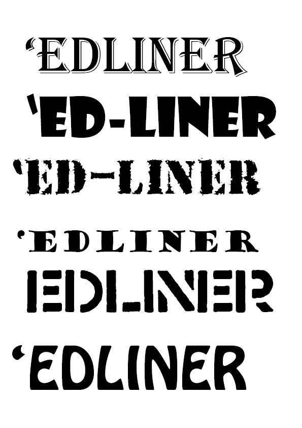
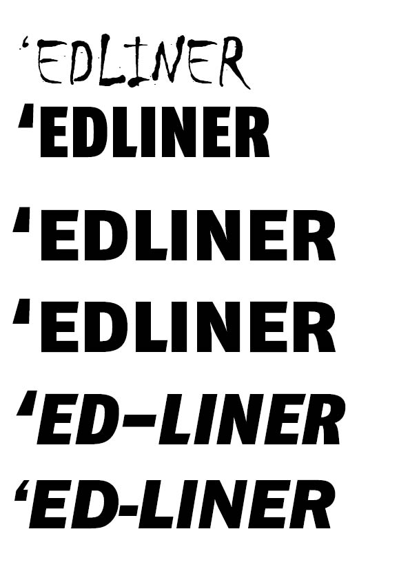
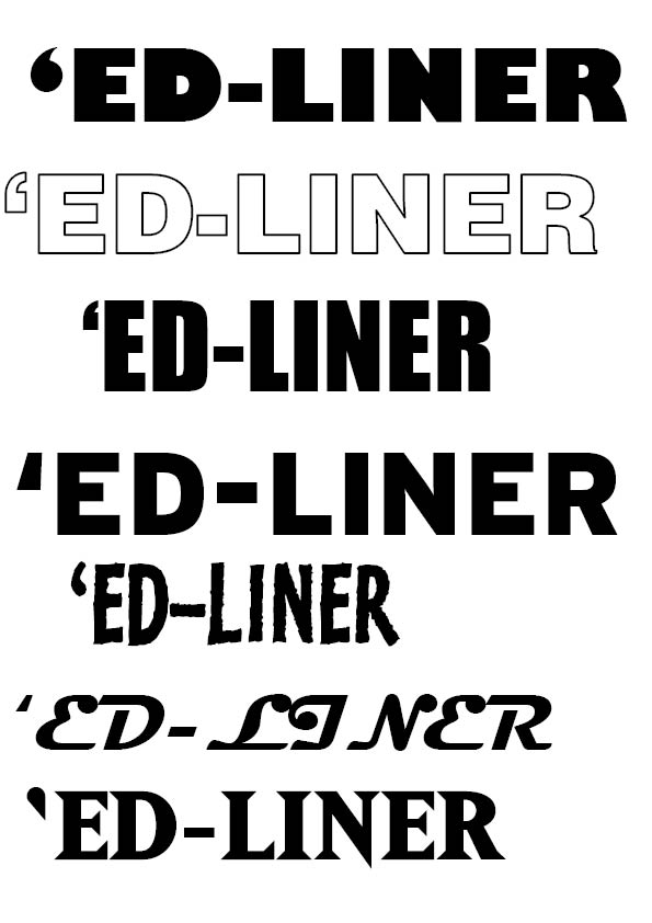
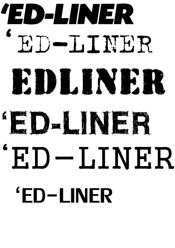

As you can see, I tried out quite a few! I looked through them all, then narrowed it down to these..

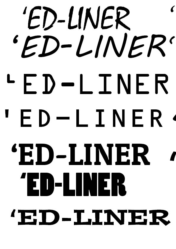
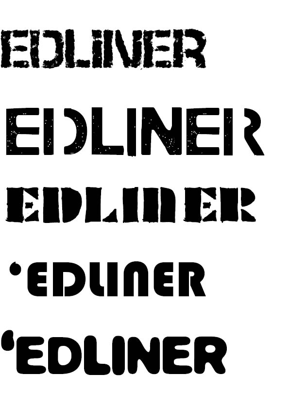
The fourth one down was the one I liked the best, which is Kosmik-BoldOne. It has the edgy look I wanted and appears torn around the edges making it look like it is breaking through the paper, I like that it is a little rough around the edges. Once I had chosen my typeface, I needed to work out how to have the masthead laid out. For this I tried out different variations in InDesign.
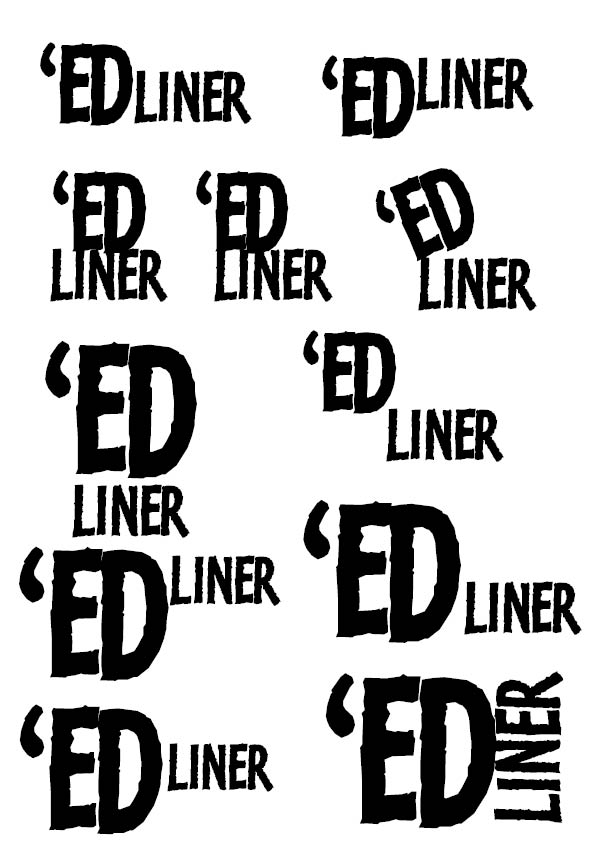
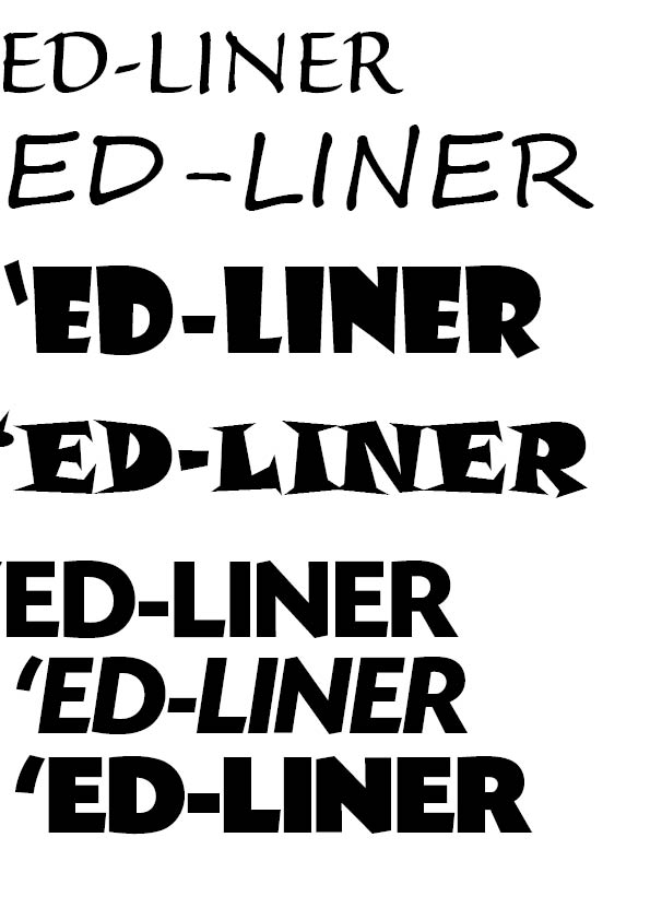
I wanted to try out lots of different variations, as I didn’t want it to just be on one line, as this would stray away from the edginess I would like my mag to portray. I liked the idea of making the ‘ED’ bigger and having this as the focal point of the masthead, so I tried out different ways of having the type. I picked out two of my favourites below, I like the idea of having the liner, lined up with the’ED’.
At this point, I still couldn’t decide which one looks the best so I decided to try it on my cover, I have chosen a picture of Annie Mac, as I am considering reviewing the Tramlines festival, which she is in the line-up for. Using what I had learnt from my research, it is a good idea to have a famous figure on the front page to grab the reader’s attention. This will also help me to figure out where best to place the masthead.
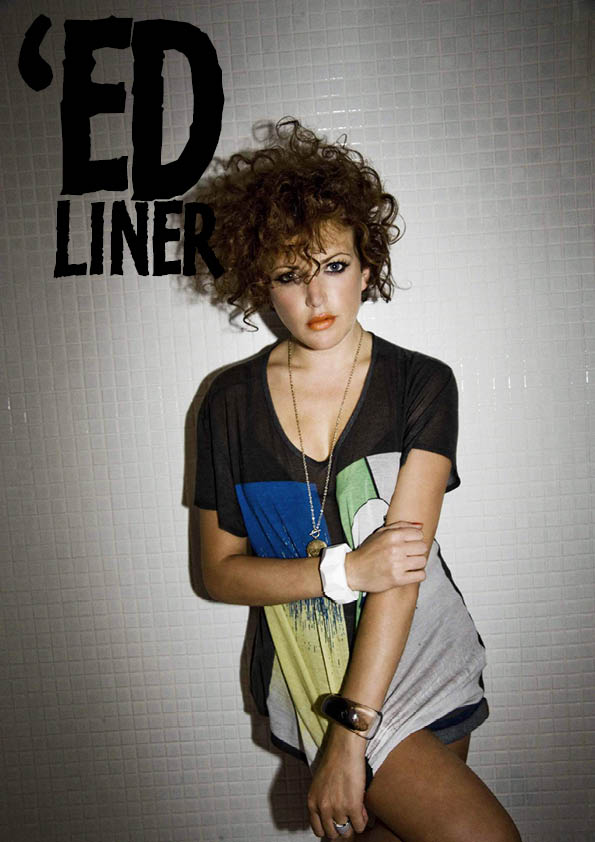
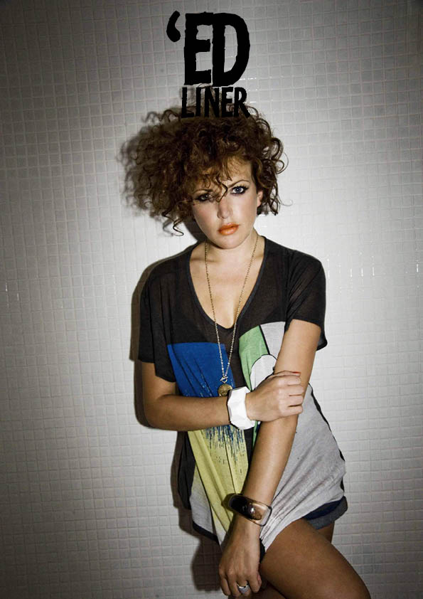
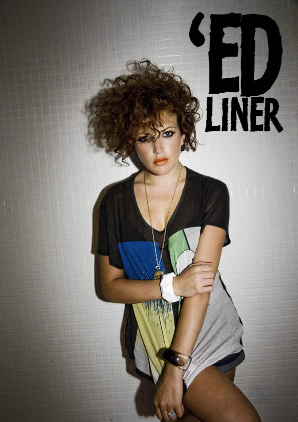
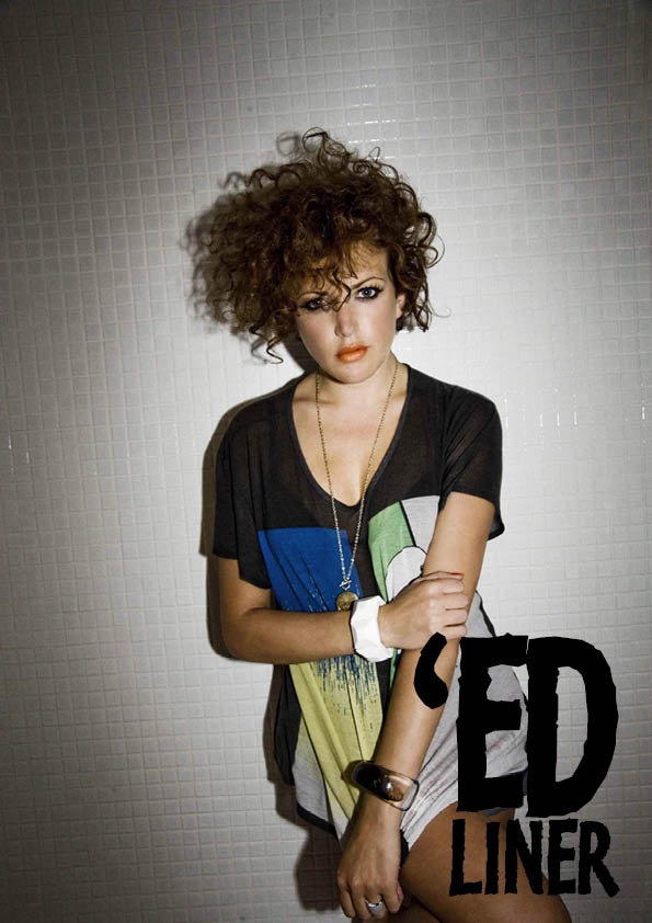
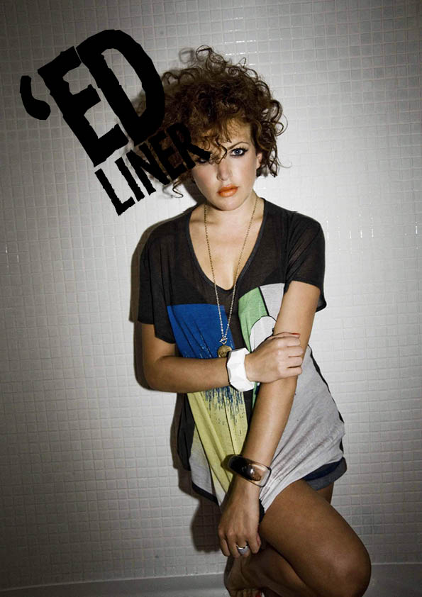
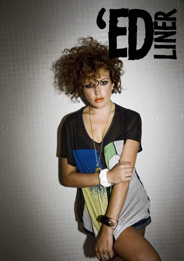
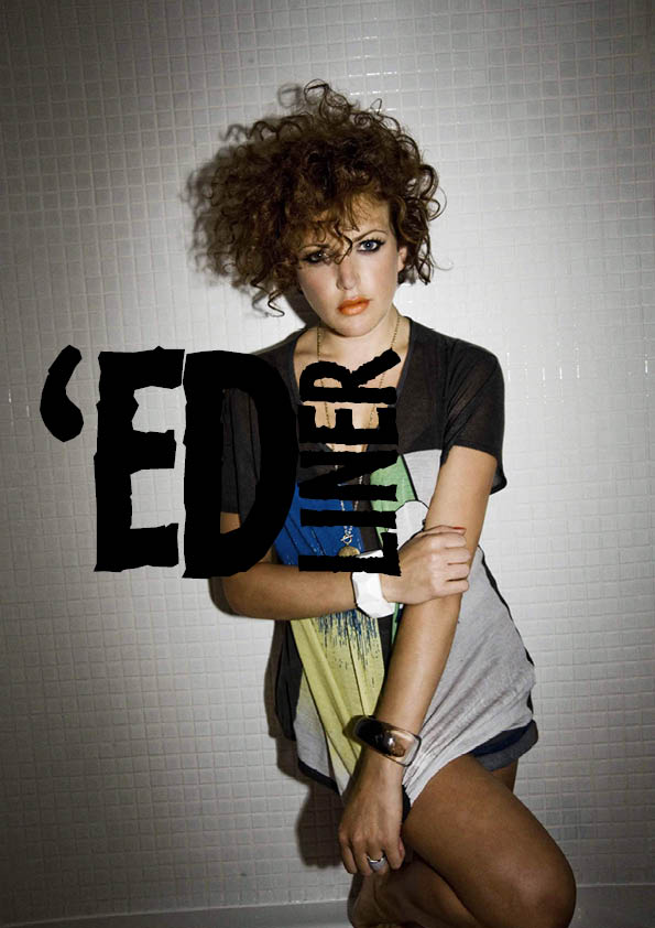
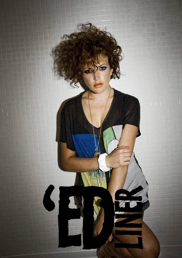
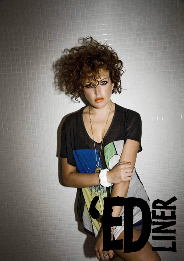
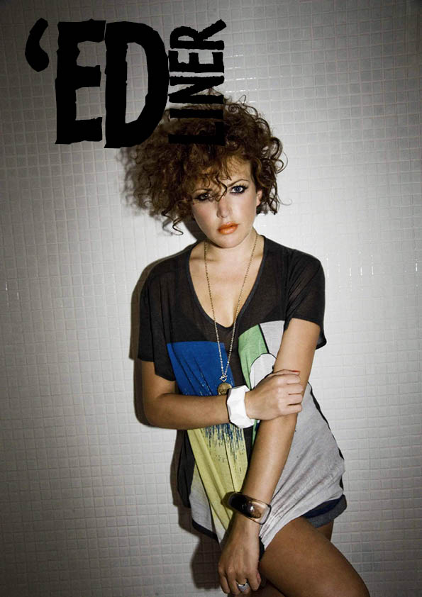
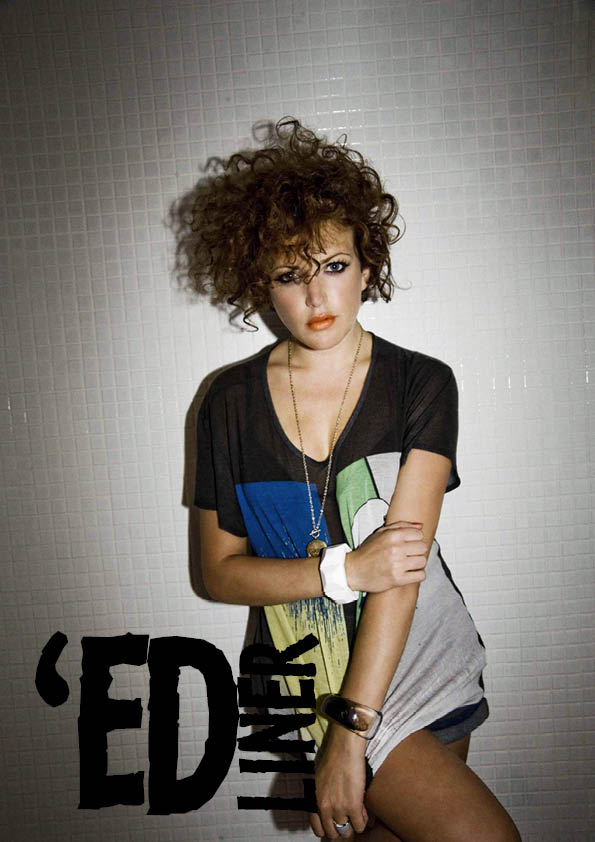
After doing this, I could see which of my mastheads is most effective. I prefer having the ‘LINER’ to the right of the ‘ED’ with the type facing vertical and going upwards. At this stage I think the masthead would look best at the top right of the cover.
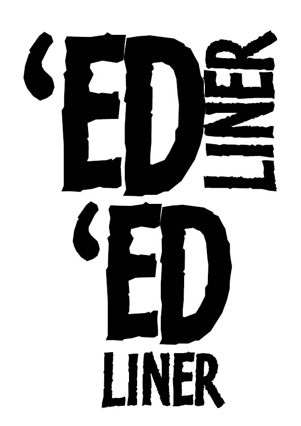
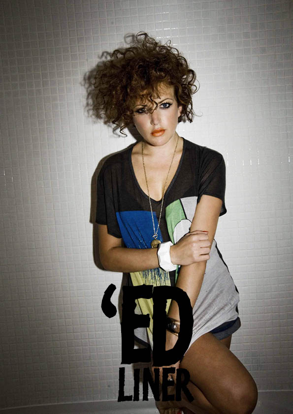
Now that I have the basics of my masthead, its time for a bit of fine tuning. I used guides to ensure that the edges of ‘LINER’ line up with the ‘E’ in ‘ED’. I reduced the kerning slightly between the apostrophe and the E and between the E and D. I then adjusted the height of the letter L to give a bit of a frame effect at the bottom and to keep in with the ‘edgy’ theme and ensured that the spacings between the two words and the lettering matched.

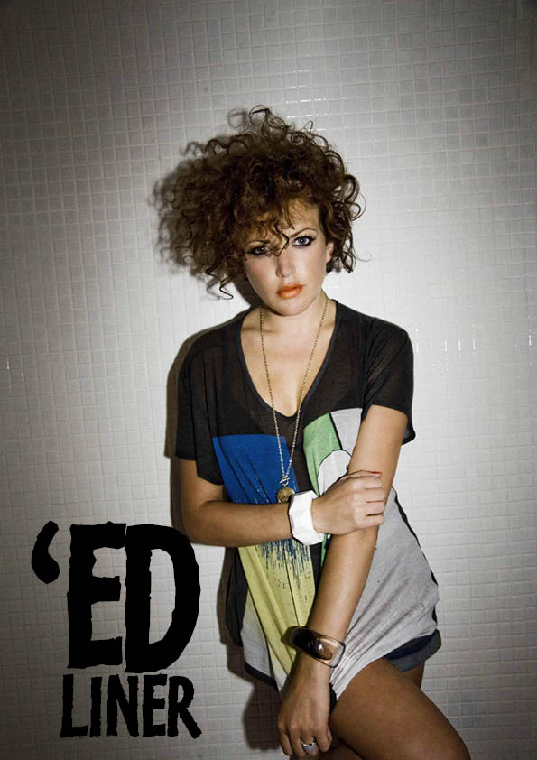
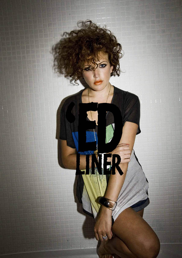
The masthead is now a rectangular shape, I decided to try putting boxes around it so that it can be on a white background and not be interfered with by the feature image.

I’m not sure at this stage whether to have a box around the masthead or not, this will be something I will decide later in the project.
THE SPREADS
For this project, we are required to do 3 magazine spreads. For my first I have chosen to do an interview with established artist James Coates, after arranging a time for the interview, I got my questions together. I began by looking at other interviews with artists to get an idea of what to ask him. I also wanted to keep in mind what a typical Sheffield student may want to have the answers to. As James is an entrepener and has set out on his own to produce and sell his paintings, I wanted my questions to allow him to give advice to anyone out there wishing to take up painting professionally or as a hobby. I plan to record the interview, as James is quite a witty character, I wanted this to come across in the interview spread and will try to keep to exactly what he says in the interview. I already have some good images of his artwork, which I will use to display in the spread, I plan to get more at the interview and some of him in his studio. I am also hoping for some good quotes from James so that I can also display these as part of the presentation. I wanted to keep my questions quite simple and broad, so that they could be elaborated on whilst in the interview either by myself or James so that the content of the spread is not too rigid or boring and flows well for the reader.
The interview went well, I went home and transcribed what was said word for word into a document.

I’d already had some ideas about how to have the layout, as I wanted to display his artwork at its best, I decided to have the spread over 4 pages so that the images and text arn’t too small or squeezed together.


I then created a layout on InDesign to work with. I decided I wanted to work to 3 columns but I set the document to have 6, so that I had to guide to add quotes at the side of images or text. I wanted the main title to be the artist’s name, I adjusted the size to fit, which ended up at around 134pt, I was tempted to fill the space above the name or have the name at the top of the page, but resisted as we had been advised to not be afraid of white space!

Then I transferred each question one by one into its own text box in the document.

I then picked out quotes from each of the questions which I thought would be good for the reader to get an idea of the content. I chose sentences, which were short, funny or inspirational. I put these in font size 17pt and chose pink and blue colours, as these are the colours mostly used in James’ paintings.

Now it was a case of arranging it all! It was like doing a big jigsaw! I kept in mind the advice regarding having white space and had to stop myself several times from having all the text bunched together with no spaces! I soon realised, as it was coming together, how much more professional it looks with space around the quotes. I put all the images I wanted to include in my workspace and arranged them around the questions as best I could, trying to maintain my original layout design. After feedback from Matt, I changed the title to be stacked on the right page as it didn’t work going across the spine, I resized the picture of James and took a couple of the images out as it looked a little too busy.
I’d seen during my research how some magazines will have pages of different colours in spreads of more than one page, I chose Grey, as I didn’t want to colour to clash or takeaway from any of the artwork, I decided to leave the second page white. I opted to have the writing in white on grey and the reverse for the other page, which I think works well, I chose Today-Shop Bold typeface for the questions and Today-Shop-Light for the answers both set to 10pt. I toyed with different ways of laying out the questions, I knew I wanted the Question to be in bold and the answer light, I chose Typeface Today-Shop, which is used throughout the spread, I used the italic version for the quotations. I wanted the colours to link in with the questions so I decided to set Q and A’s in fontsize 16pt, Today-Shop-Bold, I had to change the leading between the question and the answer to 14pt to reduce the gaps. Once I had finished the design, I thought it needed something else, so I tried out different lines in-between the text, I liked the dashed lines and I used a variant of the blue and pink colours I had used. Once I had done my first 2 pages, the 3rd and 4th were much easier, as I already had my layout design.
I decided to feature the painting of James’ face, as the questions on this page were him giving advice. I placed the quotes randomly, whilst still keeping them in the area at which the relating question/answer was on the page. I purposefully put the quotes about strawberries next to the painting of the strawberries and chose to place the marmite picture on the 4th page, to reveal to the reader why there was a question about Marmite on the previous page. The marmite image was taken in 2 halves, so I had to do some editing on photoshop. I deviated from the original layout slightly in order to fit in all the quotes and images, also I didn’t want it to look to uniformed, as this is a fun, youthful magazine.
I am really happy with this spread, in the beginning I felt like I couldn’t do it and it wasn’t looking professional enough, but once I started piecing it all together, I found it easier. I really like the colour scheme and the way the quotes are presented, I think these are what makes the spread stand-out to me.
Right, 2 more spreads to go! Oh dear..
SPREAD 2
Right so for my next one I decided to do a review of a pizza takeaway …stick with me! Its a new restaurant opened on Abbeydale Road and their speciality is stone baked pizzas, as there are so many pizza places around who do big greasy pizzas with rubbish toppings, I thought this one deserved a review, as the toppings are fresh and good quality and the bases are thin and crispy. I know that most magazines do reviews of restaurants and such like but I thought as this is a student magazine, for students living on a budget who can’t afford to eat out,, this would be a fitting review. I got to speak with the managers and they were happy for me to take pictures and write a review, I even got a big fat 15″ pizza for free, so its gotta be worth it!
First of all I went to the restaurant and got some pics, I took pics of them making the pizza and got shots of it in the clay oven which is their USP, I took the pizza home to try (for review purposes!) and made notes of what I enjoyed about it. (I have eaten from this place before so I knew it would be good). I then decided to work on my layout, when I first started to put text onto the document, I wanted to put key words such as delicious, tasty, stone baked etc, after trying to arrange this, I thought about doing a word cloud, ya know those things that are in at the moment where the words are set in different sizes, with the most relevent/true more prominent. Now this wasn’t an easy task! I first opened a new document and typed all the words I could think of about tasty food and pizzas, then I drew a circle and set about fitting the words into the shape of the circle, I chose colours associated with the colours of a pizza and chose only a few so as not to make it too busy. I changed the sizes of the words, picking out the ones I wanted to come across and making them the largest. It took sometime and again it was like doing a jigsaw, heres what I came up with.

I chose a picture of the pizza coming out of the oven, did some editing in photoshop to make it look better and blurred the background so that the focus was on the pizza, I had taken a picture with space to the right purposefully so that I had space to put my review, I placed it on the page and drew around the edge of it so that mt text could wrap around it. Then I added my word cloud
 Now I’d learnt from my previous spread that it best to get the dialogue down before on a separate document so that I know what I have to work with. I wrote a short review, with questions and answers that I thought people would like to know.
I tinkered with the images a bit, at first I had thumbnail images at the right side but after feedback from Matt, he thought more could be done with them. I first put the images in the shapes of circles, then I decided to try to be a bit more inventive and I tried to cut out the shape of a pizza slice, I added text wrapping and arranged them around the text, I also added ‘Just Eat’ and ‘Hungry House’ Logos at the bottom, I had to do some editing on Photoshop to remove the white background. I also made the first letter of each question a larger typeface to the rest at 16pt, as this is something I found to be quite effective in my research.
I am quite happy with this spread, I wish maybe I’d chosen a different subject but working with what I had I think it has come out OK. I’m glad I was a little more creative with the images, doing this has further developed my skills in using the pathfinder tool. I am also really happy with my typography pizza and am considering doing something similar for my next spread. At this point for each spread I added a footer of page numbers centred and a header with the masthead and subject eg. food.
SPREAD 3
I wanted to do something informative for students in this spread , I considered doing a festival guide or a guide to tramlines, then I considered the fact that summer holidays are approaching and looked into ideas for a guide of what to do over the summer, I considered fashion, books, games, days out, nights out etc.
I liked the idea of doing a festival guide but figured most students can’t afford to go to a lot of the festivals around as they are so expensive. I decided to look specifically at events in Sheffield, I looked into things that were relatively cheap or free, as this was to show that you don’t have to spend a fortune to have a good time. I looked into local fairs etc and I wrote out a big list of everything that was listed over the summer, trying to keep in mind the target audience (young people) and what they would like to go to, so no gardening exhibitions or knitting contests! The list was quite extensive!
There was far too much to fit into a spread, even though there were some good events happening in Sheffield, it would take away the practicality of it if there was too much for the reader to take in. So how could I reduce this list down?.. I decided it needed to be filtered down to one particular genre, I picked music, so I eliminated anything that wasn’t music, there was still quite a lot, so I then took out anything that cost over £20. Now I had a list that could be worked with. I decided to sketch out the events I would like to include on a a3 sheet of paper to get an idea of the layout.
I then started to sketch out how I would like the layout to look, I had in mind the idea of a calendar of the events, with the focus being on the dates, I tried out lots of ideas. I then got images of the bands from the internet, getting the best possible quality, I then started laying it out in InDesign. I originally had the bands as thumbnail images and a write up of each band but then after looking at other mag spreads decided to have the image as the main part and less text. I wanted there to be an introductory page as the first page, explaining what he spread was about. I first put an image of a concert in and tried adding text but it wasn’t looking right. I’ve got to admit at this stage I became a little stuck! I wanted to do something typographically, like the one in the pizza review, I considered doing another word cloud like the one in the pizza review, thinking this could maybe be a theme of my magazine. I decided to look into other ideas, I had in mind a quote about music or some key wording which I could design with typography making it edgy and eye-catching. I wrote down some ideas, I liked the idea of having stacked relevant words with the first letters spelling out something else, like music or rock, so I toyed around with this idea. It wasn’t really working for me.. I then listed all the words I could think of associated with music and concerts to see if I could come up with anything else.

I decided I would do a typographic word cloud in the shape of a guitar, sticking with the original idea of having this as a theme and also to challenge myself to see if I could do it. I began by downloading an image of a guitar and opening it in photoshop, I selected the shape of it then filled it with a light grey colour, I wasn’t too concerned about how this looked as I just needed a stencil to work with.

I then opened the image in InDesign and began adding my words one by one onto the document, I chose Kosmik-Bold-One, as I feel this has a rocky feel to it.

I then began to arrange these into the shape of the guitar, I picked out the words I would like to be more prominent like Sheffield and Talent and placed these first, then I picked out words that began or ended with letters that were shaped similar to the edges of the guitar.
Once I had all my words placed into the guitar, I had to think up some more to fit some small gaps, then I zoomed into each one individually to check that none overlapped. I had the guitar outline on a separate layer so that I could hide it occasionally to see how it was looking. Heres the finished typographic guitar.
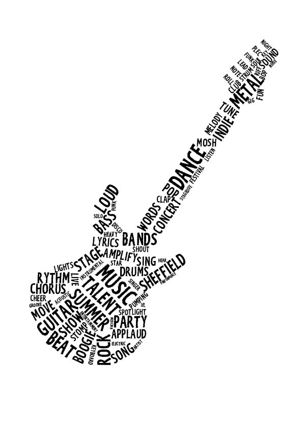
I am really pleased with it, I put the words MUSIC, TALENT and SUMMER at an angle so that it looked like the hole thing in the guitar.. don’t know what its called! I did the text in black with a view to change the colours but actually looking at it, I think that it looks good just black, I may play around with colours at a later stage, maybe Red and Black.
The spread
I tried out different ways of having the dates and I found this to be the best, I stuck with black and Red colours and reversed these out to differentiate from each section. I decided not to include August as there arn’t many listings out at present and the August page would have looked a little sparse compared, I figured this would be done in the next issue! I kept the text down to a minimum, as I wanted the images to lead, I varied the sizes of the images so that it didn’t look too uniform.
I really struggled with this one if I’m honest and I’m still not happy with it entirely. However whilst creating it, I learnt a lot about the benefits of designing a layout. This was actually the first one I started and then went back to after I’d finished the others. I didn’t design the layout as well as the others in the beginning and instead I kind of just plonked everything on the page and tried to arrange it, which took a lot longer than the others did, as I was trying to design it as I went along. I now know this is the wrong way to do it!
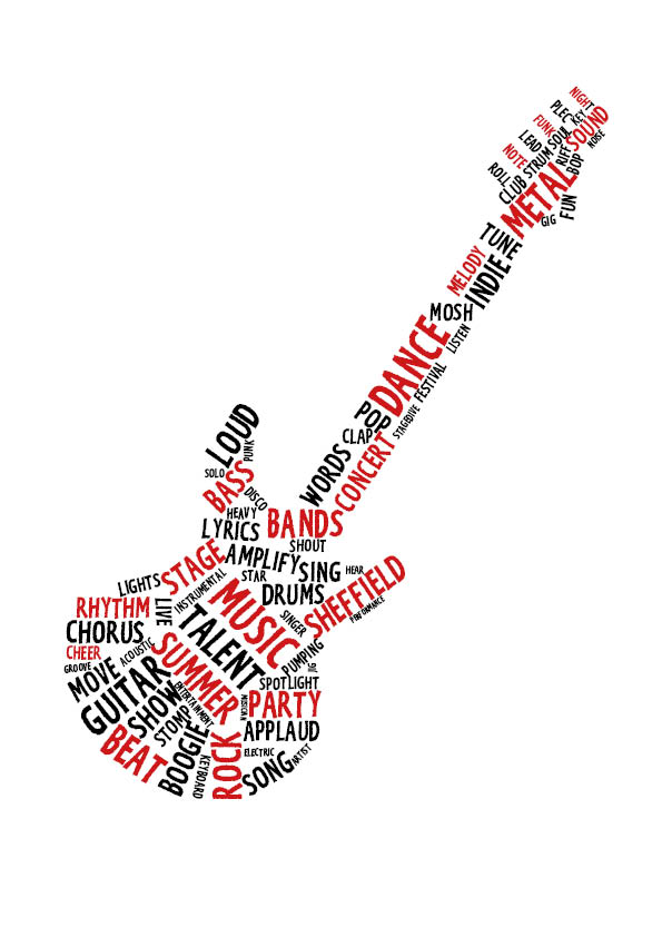
..I decided to add colour to the Typography guitar, I decided just to stick to red and black, as I didn’t want it to look too messy and it also fits in with the colour scheme. I think it looks much better this way.
BACK TO THE COVERS
Now that I have my spreads, I have a better idea of how to have the covers. I already had the layout set out from before, so it was just a case of adding the features and cover titles.
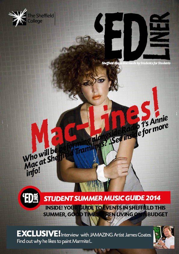
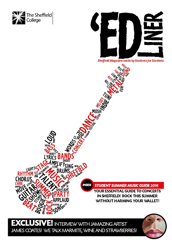
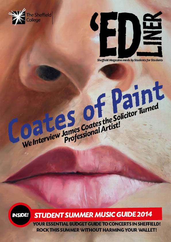
I decided to do 3 as I wanted one music orientated and the others to have art as the feature image. I’ve kept the same layout for all, slightly changing the colours to match with the feature image.
FINAL EVALUATION
I have really enjoyed this project and have learnt a lot. I’m not overly happy with my final spreads, if I could do things differently I would make the layout much more simple and not as busy. I’ve tried to fit too much content into too little space, although I do think that my content is good. For the interview with James, I wanted to feature some of his best work and I think this ruined the design, maybe I should have had the spread over more pages, having one painting filling a whole page. I think the area I have developed most in, is typography. This is something that has always frightened me a little! I feel much more confident now and have learnt what techniques work best to present the type and its not just a case of plonking some words onto a page. I am really pleased with my word clouds, these are something I will develop more on.


 Aimed to appeal to parents, these would work on a person’s decisional balance, i.e. your smoking is not only effecting you but your child, this could help tip the balance and initiate steps to change.


")
")
")

")
")
")
")
")
")
")
")
")

")
")
")
")
")


")
")


")
")
")
")
")
")
")
")
")
")
")
")


")
")

")


")